Workable website redesign
Workable’s marketing website had grown fast, but not always strategically. As new product lines launched and pages piled up, the brand started to feel fragmented, the navigation bloated, and the mobile experience… let’s say “inconsistent.” We needed more than a visual facelift. We needed a rearchitecture of how we communicated who we are, what we offer, and why it matters.
As Principal Brand Designer, I led the creative direction for the website redesign, working cross-functionally with marketing, product marketing, content, and dev. Beyond making it “look better,” I focused on:
Translating positioning into visual hierarchy
Building a flexible design system from the ground up
Ensuring that every component could scale across 50+ markets
Driving adoption across teams with updated brand guidelines and interactive documentation
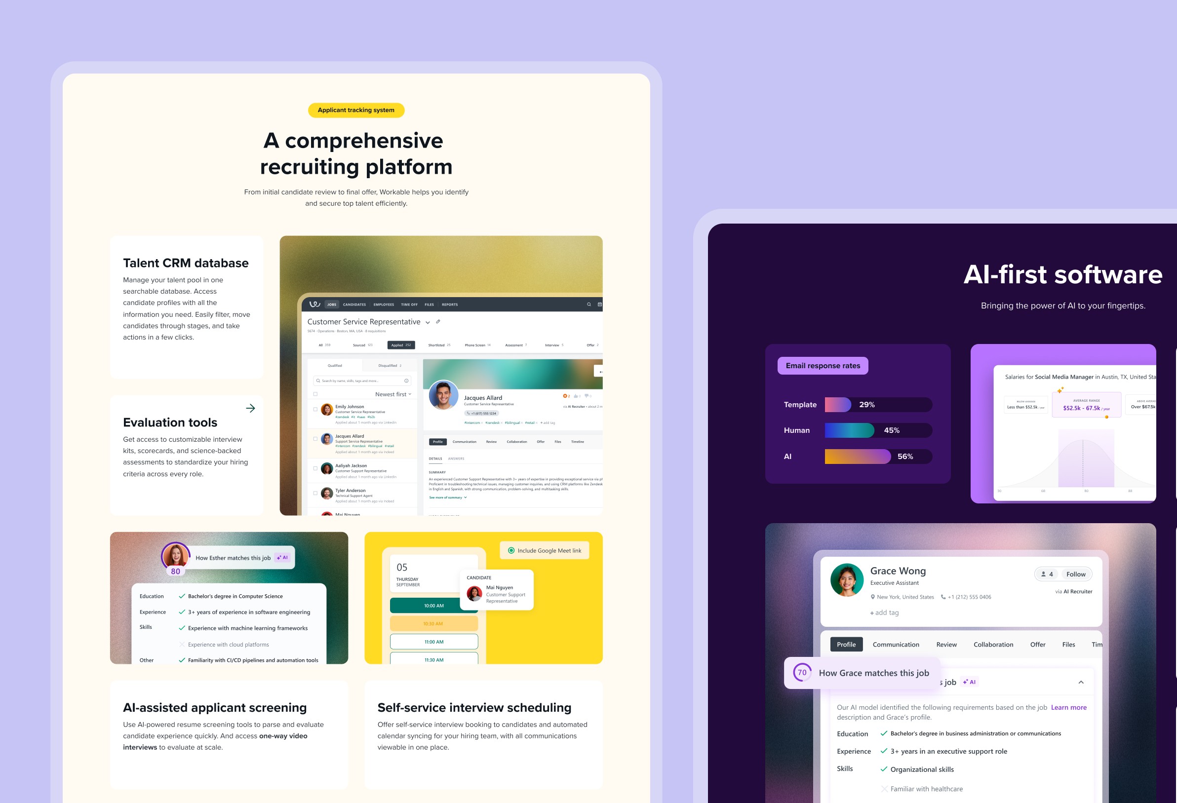
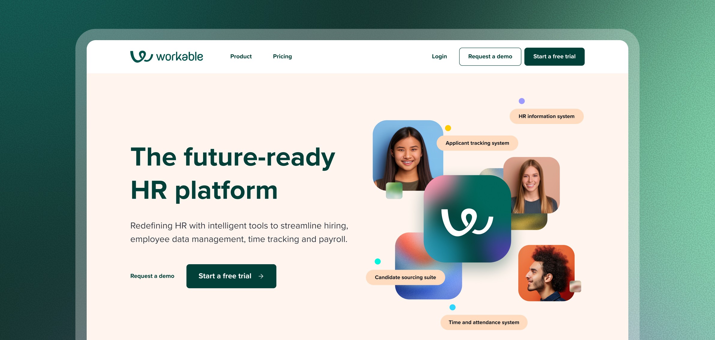
1. Bento box layout with purpose
Rather than following traditional SaaS page grids, we introduced a bento-box layout, modular yet expressive. This let us mix and match brand stories with product proof, showing flexibility across use cases without sacrificing clarity.
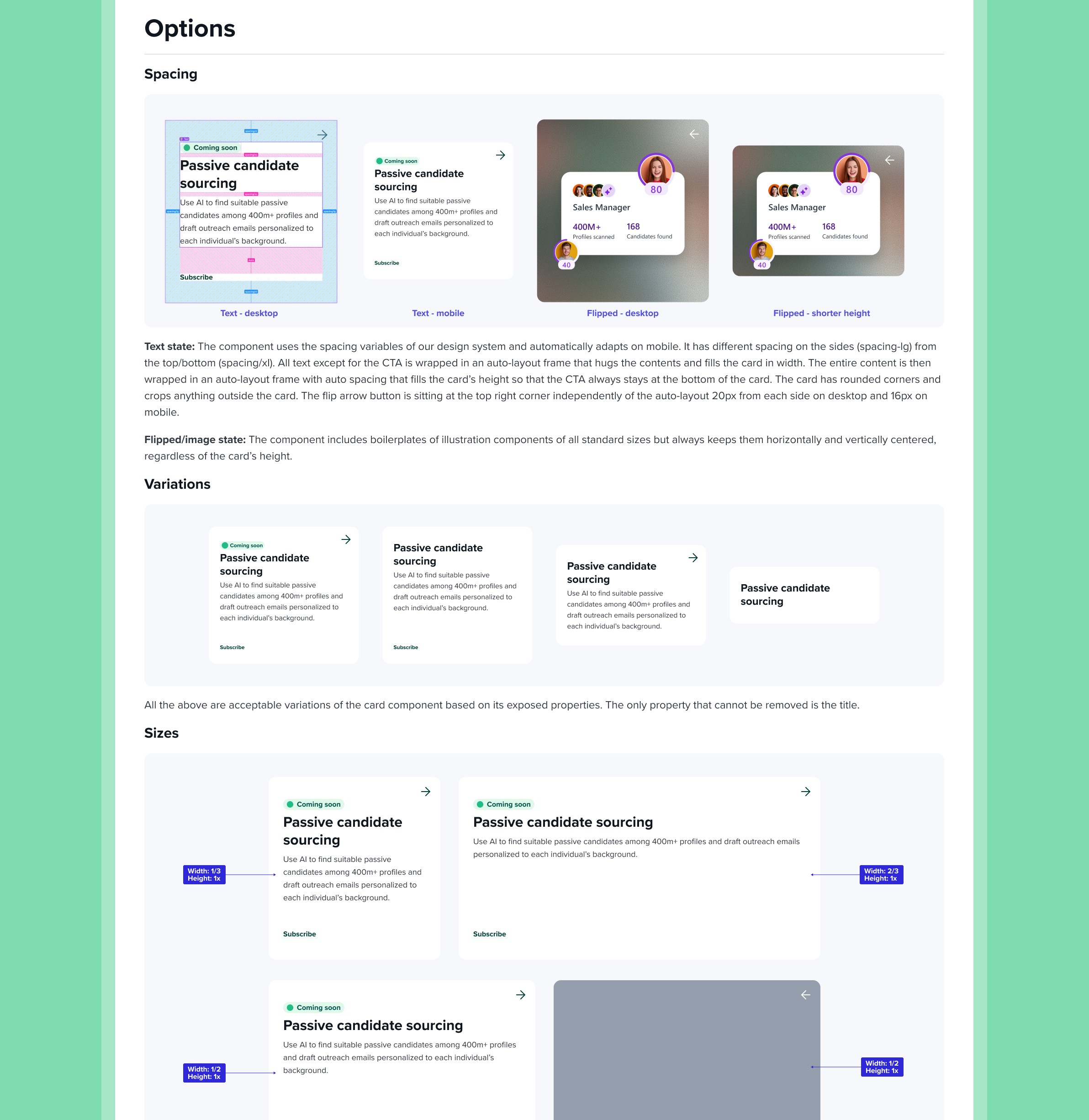
Each block became a systemized “unit of meaning”, a reusable, standalone story block
Layout rules adapted based on screen size, priority level, and adjacent content types
Visual rhythm was intentionally interrupted in places to feel more editorial than templated
2. Responsive by design (not afterthought)
We approached responsiveness early in the design system itself, testing modules against real content and devices, not just generic breakpoints.
Priority content always surfaced on mobile
Clear motion cues were introduced to reinforce navigation and hierarchy
Hero areas adjusted CTA prominence based on device type and screen real estate

3. From scattered to systematic
We used this redesign as a catalyst to rebuild our brand guidelines and visual identity. I architected a system that could scale from Google Slides to out-of-home campaigns:
Reorganized typography, color, spacing, and iconography rules
Created “componentized storytelling” principles to ensure consistency across brand, product, and marketing
Built a live brand assistant (powered by GPT + n8n) to make our new logic searchable, suggestable, and actually usable
4. From website to platform
We treated the site as a living part of the brand system. Every decision, spacing, interaction, content logic, was documented and modularized. This allowed marketing and product teams to update pages or spin up variants without breaking the system.

Results and Impact
+8% increase in demo requests after launch
Clearer brand differentiation across global markets
Faster campaign rollout due to systemized content blocks
Internal alignment around one source of truth for design logic
This wasn’t just a new coat of paint. It was a shift toward brand systems that are alive, adaptable, and as intentional in structure as they are in tone. It taught us that design isn’t just how it looks, it’s how it scales, how it adapts, and how it helps people make decisions faster.
NEXT CASE STUDY
Lacta: From the Start
"From the start" is a 5-part web-series, that tells the story of a man who doesn't believe in love, falling for the girl he sees in a dream, he has each time he eats a piece of Lacta chocolate. Read about the 2 Cannes Lions winner.
→